Maho vs Vivaldi: two power-user browsers, two centuries
Vivaldi has been the answer to “which browser respects power users” for almost ten years. That answer was correct in 2016 and it is still partly correct today. The shape of “power user” has changed since then, and the browsers built for it have to change with it.
This post compares Maho and Vivaldi the way a long-time Vivaldi user would, with no claim that one beats the other on every axis. The honest version is that they win in different places.
The Vivaldi heritage, briefly
Section titled “The Vivaldi heritage, briefly”Vivaldi was started in 2015 by people from the original Opera team, with a clear goal. Build a browser that does not strip features out for the average user. The result was a browser with tab stacks, side panels with web panels inside them, mouse gestures, command chains, deep theming, and a settings surface deep enough to lose a weekend in.
The Vivaldi bet was that a vocal minority of users wanted more configurability than Chrome offered, and would put up with a slightly heavier UI to get it. The bet was right. Vivaldi has a small but extremely loyal user base, mostly on desktop, mostly on Linux and Windows, with a respectable showing on macOS.
The Vivaldi philosophy is additive. Most decisions in the product can be configured. There is rarely one way to do something. The cost of that approach is a settings surface that takes time to learn and a UI that can feel busy if you do not curate it.
Maho’s heritage, briefly
Section titled “Maho’s heritage, briefly”Maho is much younger. We started in 2025 on top of Chromium with a different bet. Power users in 2026 want a small set of strong primitives, not a thousand toggles. The browser should be opinionated about the shape of the workflow and quiet about the rest.
The Maho philosophy is a few sharp tools, not a Swiss Army knife. Boosts, Spaces, and a side panel that doubles as the AI control surface. Keyboard-first invocation. BYOK and zero default telemetry. We deliberately ship with fewer settings than Vivaldi. We add a setting only when the absence of it forced a real workaround for a real user.
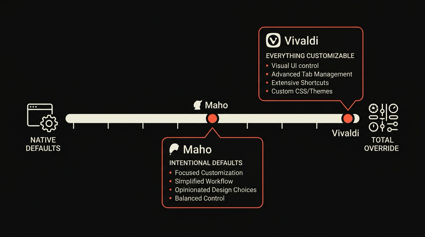
The two heritages are not in conflict. They are different answers to “what does a power user want from a browser this year”. Vivaldi’s answer is more knobs. Ours is fewer, sharper knobs.
Customization comparison: chrome panels vs Boosts
Section titled “Customization comparison: chrome panels vs Boosts”This is the axis where the two browsers differ most.
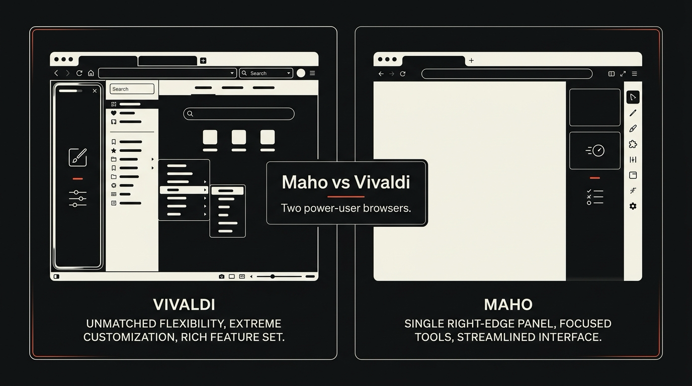
Vivaldi’s approach is web panels and theming. A web panel is a sidebar that hosts a web page, sized to your liking, switchable, persistent across sessions. You can run a chat client, a calendar, a Discord, anything that renders in HTML. The chrome around the page is themable down to the corner radius, and the toolbar is a kit of buttons you assemble.
Maho’s approach is Boosts. A Boost is a per-site overlay: a snippet of CSS, a snippet of JS, or a small set of declarative rules that change how a page looks or behaves for you. Boosts compose, they are versioned, they sync, and they are scoped per site. They do not change the browser chrome. They change the page.
The two solve overlapping problems with very different shapes. Vivaldi gives you a customizable browser frame around the standard web. Maho gives you a customizable web inside a quiet browser frame. If your customization instinct is “I want my browser to feel like mine”, Vivaldi is more direct. If your customization instinct is “I want the web to behave the way I want”, Boosts are sharper.
The full set of Boost recipes lives in the Boosts docs. The short version is that Boosts cover what extensions used to cover before Manifest V3, plus a handful of things extensions could never do.
Tab-handling comparison: stacks vs Spaces
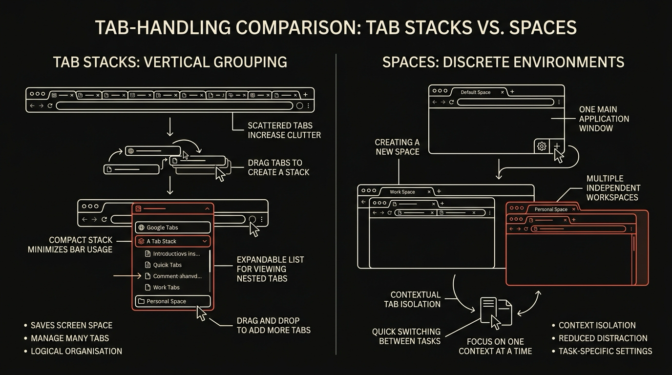
Section titled “Tab-handling comparison: stacks vs Spaces”Vivaldi’s tab stacks let you group tabs into a single tab that expands. You can rename a stack, color it, and move it as a unit. Stacks are local to a window. Stacks have been in Vivaldi since the beginning, and they have aged well.
Maho uses Spaces, which is a different shape. A Space is a set of tabs plus a set of pinned items, with its own session state and its own assistant context. You switch Spaces and the entire tab strip changes. We have one for Work, one for Personal, one for the current project. The set of Spaces syncs across machines. The current Space is what the side panel sees when you ask it about “open tabs”.
Stacks are a tab grouping primitive. Spaces are a workspace primitive. They are not strictly competitors. We use Spaces for the same reason a lot of people use multiple windows: context separation that survives a restart. The fact that the assistant honors Space boundaries is the Maho-specific addition.
Vivaldi has stack-of-stacks and tab tiling, both of which Maho does not have. If you live in a single window with twenty tabs and want hierarchical grouping plus side-by-side tiling, Vivaldi is the better fit today. We may add tiling. We are unlikely to add stack-of-stacks, because Spaces solves a related problem with less depth.
AI integration comparison
Section titled “AI integration comparison”This is the axis where the two browsers diverge by design.
| Capability | Vivaldi | Maho | |------------|---------|------| | Built-in AI surface | Yes, via Aria assistant | Yes, side panel | | Tool use | Limited, vendor-defined | Nine built-in tools, typed | | BYOK | No, vendor cloud | Yes, default | | Local model support | No | Yes, via Ollama or LM Studio | | Page context | Yes, summarize current page | Yes, plus tab and Space awareness | | Per-call permission prompts | Limited | Per tool, per origin, per session | | Telemetry on AI | Vendor managed | Zero by default |
Vivaldi shipped Aria as a managed assistant with a vendor contract. That is a defensible product choice and it gets a lot of users to a working assistant in zero clicks. The cost is the one we wrote about in our BYOK vs managed AI post: you do not pick the model, you do not see the routing, and the data posture is vendor-defined.
Maho’s posture is the opposite. The assistant is BYOK by default, the side panel is the primary control surface, and the telemetry on the AI path is off unless you turn it on. The tradeoff is that you have to bring a key. We made that take ninety seconds. It is still ninety seconds more than zero.
If AI is a side feature for you, Vivaldi’s Aria is fine and gets out of your way. If AI is a daily driver and you want the data path to be transparent, Maho is built for that case.
Pick guide
Section titled “Pick guide”A direct guide, with no hedging.
Pick Vivaldi if you want a deeply themable browser frame, you have a workflow built around web panels, you live in a single window with tab stacks, you want command chains, and your AI use is occasional. Vivaldi has a decade of polish in these areas. We will not catch up on chrome customization any time soon.
Pick Maho if you are on macOS, you want Spaces over stacks, you customize pages over chrome, you want BYOK with the option to run local, and the assistant is part of how you actually browse. Maho is built for that shape. The deeper customization knobs Vivaldi has, we do not have, and may never have.
Pick both if you have time. They cohabit fine. Some of our users keep Vivaldi for their long-term reading workflow and use Maho for the work that involves the assistant.
A side-by-side feature matrix lives on our compare page. We update it when we ship something material, and we link to Vivaldi’s own positioning whenever we summarize their side.
Join the waitlist
Section titled “Join the waitlist”Maho is in pre-release on macOS. If the heritage and the shape above match how you want to browse, join the waitlist.