The side panel as a control surface, not a chat box
The side panel is the most boring decision Maho ships, and it took the longest to make. We argued about it for three months. We tried two other shapes in production builds. We came back to the side panel because the other two were quietly worse.
This post is the reasoning, in the order we lived through it. If you are about to build an AI surface in a browser, this is what we would tell ourselves a year ago.
Three placements we tried before settling
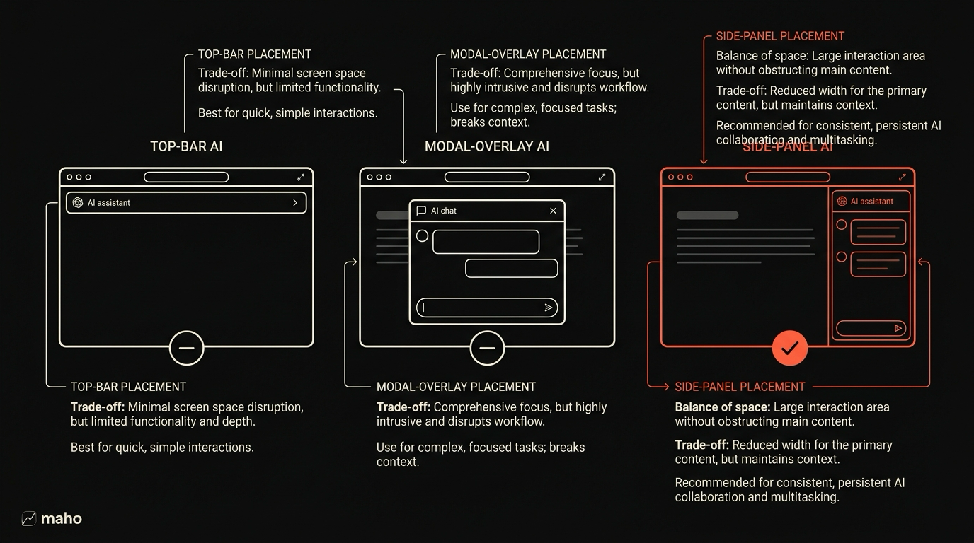
Section titled “Three placements we tried before settling”We tested three placements with internal users over the course of about ten weeks. The candidates were the omnibox, a modal overlay, and the side panel.
Omnibox. Put the assistant behind the address bar. Hit a hotkey, the omnibox expands into an input that accepts a question. Results render below it as a dropdown, the way history and bookmarks do. This is the most familiar shape. Arc shipped it. Several extensions copy it.
Modal overlay. A center-screen panel that fades in over the page, similar to Spotlight or a command palette. The assistant takes over visually, the page dims behind it, and you get a generous text area and a results pane. Linear, Raycast, and a few internal tools at large companies use this shape for non-browser AI.
Side panel. A persistent column on the right side of the window. Always present, always docked, with the assistant inside it. Visible while you read the page, scrollable, resizable.
We ran each shape for about three weeks. We watched usage, we watched cancellations, we watched the kinds of questions people asked.
Why the side panel won
Section titled “Why the side panel won”The omnibox lost on context. People used it for one-shot questions and then dismissed it. The shape is built for “go to something” or “ask one question”. When users wanted to follow up, they had to re-summon, re-type the context, and re-orient. The mental model is search, and search is the wrong model for an assistant that should remember the last three things you asked.
The modal lost on co-presence. The page disappears behind the modal. The assistant cannot show you “this is where on the page I found the answer” without an awkward dance of dismiss-and-highlight. We spent a week trying to make the modal partially transparent. It did not work. Either the page was readable and the modal was washed out, or the modal was readable and the page was hidden. There was no middle.
The side panel won on a few axes the other two could not match.
The page stays visible. You can read the source while the assistant talks about it. Highlights from the assistant can land in the page, and you see them in your peripheral vision.
The conversation persists. The panel does not dismiss. Follow-ups are free. The mental model is co-pilot, not search.
The panel is also a control surface. Buttons, toggles, tool grants, history, settings. None of those fit in an omnibox, and all of them fit in a modal but feel cramped. The side panel has the room for them and the persistence to make them findable.
The cost of the side panel is screen real estate. On a 13-inch laptop, an open panel takes roughly 28 percent of the horizontal space. We cannot fix that. We can let you collapse and expand the panel quickly, and we can keep it collapsed by default. We do both.
The four operations the panel exposes
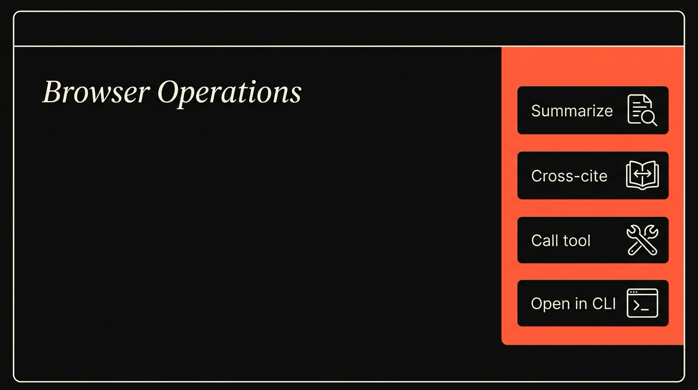
Section titled “The four operations the panel exposes”A control surface is defined by what it controls. The panel exposes four operations and we are deliberate about not adding a fifth without strong reason.
Ask. A text box that accepts a question and routes it to your model. The classic chat input. The thing every assistant has. We treat this as the lowest-value operation in the panel because everything has it, and we decline to put it at the top of the surface for that reason.
Act. A list of tool calls the assistant can make on your behalf. Open a URL, summarize a tab, fill a form, file an issue, save a snippet. Each action has a typed input and a permission scope. The panel surfaces the available actions explicitly, so you know what the assistant can do without reading docs.
Watch. A live view of what the assistant is doing right now. Pending tool calls, in-flight requests, returned results. This is the operation that turns a chat panel into a control surface. You can see the system. You can intervene. You can deny a tool call mid-flight.
Configure. Per-tool grants, per-origin grants, per-session grants. Model choice. Routing rules. The configuration that used to live in a settings page lives in the panel, near the thing it configures.
The four operations correspond to four panel modes, switchable by tab. The default is Ask, because that is the lowest-friction entry. The most-used among power users is Watch. We did not predict that and we are not surprised by it now.
Keyboard control surface
Section titled “Keyboard control surface”A control surface that requires the mouse is not really a control surface. The panel is keyboard-driven end to end.
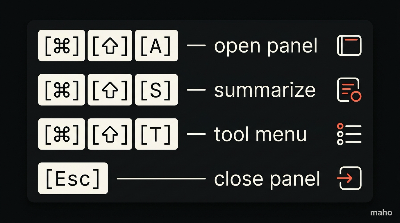
The base hotkey opens and focuses the panel. Cmd-Shift-A by default, configurable. Inside the panel, Tab cycles modes. Arrow keys navigate the action list. Enter invokes. Cmd-K inside the panel opens a command bar that is local to the panel and lists every operation it supports.
The command bar inside the panel is the thing power users live in. It accepts fuzzy text, it filters across all four operations, and it shows the keyboard shortcut next to each result. After a week, most of our internal users stopped using the panel UI directly and lived inside the command bar.
We treat the panel command bar and the global command bar as two different surfaces with overlapping content. The global one is for browser actions: open a tab, switch a Space, jump to a bookmark. The panel one is for assistant actions. They share a few entries. They do not share the same shortcut.
A full list of panel shortcuts lives in the browser AI docs, and we keep it current with the build.
The composability story
Section titled “The composability story”The panel is not isolated from the page. That is the point of putting it in the browser instead of in a desktop app.
When the assistant runs a tool that touches the page, the page reacts. A summarize call highlights the text it summarized. A fill-form call moves focus to the field it is filling. A save-snippet call shows a transient indicator at the saved location.
When the assistant references something in another tab, the panel surface includes a clickable thumbnail, and clicking it switches to that tab. The assistant’s view of the world and your view of the world are linked, not separate.
When the assistant asks for a permission, the prompt is anchored to the panel, not to a system dialog. You see what is being requested, by which tool, with what scope, in the context of the conversation that triggered the request. This is the difference between a permission system that exists and a permission system that is usable.
The composability story matters because it determines how page context flows through the assistant. We wrote about this in detail in our post on page context vs conversation context. The short version is that the panel is the thing that makes both contexts visible at the same time.
Where the panel still falls short
Section titled “Where the panel still falls short”We are not done. A few honest limits.
The panel is wide. We have a compact mode that drops it to 240 pixels, and the compact mode loses some affordances. There is no good answer for a 13-inch laptop user who wants the assistant always visible and the page at full width. You pick one.
The panel is single-conversation. You cannot run two assistant threads in parallel inside the same window. We have a design for it. We have not shipped it. The current workaround is two windows, which is fine and a little awkward.
The panel does not yet show inference cost. If you are on BYOK, you should be able to see “this question used 18k tokens at $0.06” inline. We have the data. We have not surfaced it. This is a near-term fix.
The panel command bar is keyboard-perfect on macOS and uneven on the keyboard layouts we have not tested. We are slowly fixing this. If you hit something weird, the bug tracker is the right place.
None of these are blockers. They are the next twelve months of panel work. The shape of the surface is set. The polish is the ongoing job.
Download Maho
Section titled “Download Maho”Maho is available for macOS, Windows, and Linux, with the side panel as its primary AI control surface. If the reasoning above matches how you want to work with an assistant in your browser, download Maho.